


In this post, we’re stepping out with Line, Area, Scatter, and Bubble Plots.Line charts make it easy to record trends over time. Lines connect individual data points like sums or averages on particular dates.
You can easily view trends across multiple data sets by displaying multiple lines. Line charts can also help you choreograph future trends by extrapolating how the data will play out over time. Curves instead of lines might suit you better for projections.


Dance outside the lines
Area Charts give you the ability to visualize volume by filling the area below the lines with color.
The total colored area demonstrates change in volume over time. Combining line charts with area charts can help users see how specific data points impact quantitative data.
For example, your area chart may show monthly recurring revenue growth, while a line chart overlay may show the number of marketing events conducted each month.

It's ok to be a scatterbrain
Scatter plot visualizations display individual data points mapped to a grid of criteria. For instance, you could create one axis for time of day and another axis for length of call, then map all calls to find out if time of day impacts the length of the call.
Scatter plots help identify relationships between two variables so you can recognize unusual features. When data points cluster away from your enterprise goals, you can intervene and turn processes around quickly.
Scatter (and Bubble) plots are more information dense than the other charts, which means they can be incredibly powerful, providing rich intelligence about your data. Scatter and Bubble plots can display up to four axes, creating extremely dense visual data.
But don’t worry. With Skuid scatter charts, you can just click and drag to select an area to zoom into, pulling it up close and personal. Watch your hands.
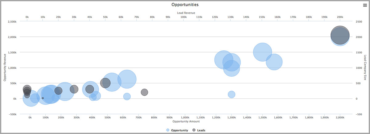
Create more bubbles than Lawrence Welk
Bubbles on a scatter plot can introduce a third, or even a fourth, variable to your data. Different colored bubbles could represent different types of data, such as leads and opportunities (see the chart below). The size of the bubble on your scatter plot represents a quantitative measure.
For example, you might have blue bubbles represent the level of customer satisfaction for calls in your call center, along with the time of day and length of call. Though calls may be longer in the afternoon, you may want to pay attention to the corresponding dramatic increase in customer satisfaction.
Be careful, though. As is the case with all visualizations, there may be outliers. If Frank has only been working for you for three days, his calls may be much longer and customer satisfaction may be lower.Want to start creating beautiful charts for yourself? Get a free Skuid trial!


