
.jpg)
What is responsive web design?
Smartphones and tablets have changed the way we use the web. Before, designers focused on optimizing a web page for PCs and laptops on one or two browsers. Now, designers need to understand how to integrate touch, how pixel resolution will impact flow and layout, and how different mobile and desktop browsers work.
A great solution to this is responsive web design, a way of laying out web pages so that the content and layout adapt to the screen size of the device being used. This is not the same as automating the content to shrink down to mobile size or to stretch out to desktop/laptop/tablet sizes. Beyond that, true responsive web design is dedicated to understanding the end user experience.
Understanding the user experience solves issues on all sides of the aisle. For organizations updating their online presence, user-focused, responsive design means a greater return on investment with money saved from developing separate solutions for mobile and desktop. For visitors and end-users, responsive design offers a dependable, intuitive solution regardless of the access point. It all comes down to putting yourself in the shoes of people visiting your website or using your product, a guiding principle called human-centered design.
Building on the web with human-centered design
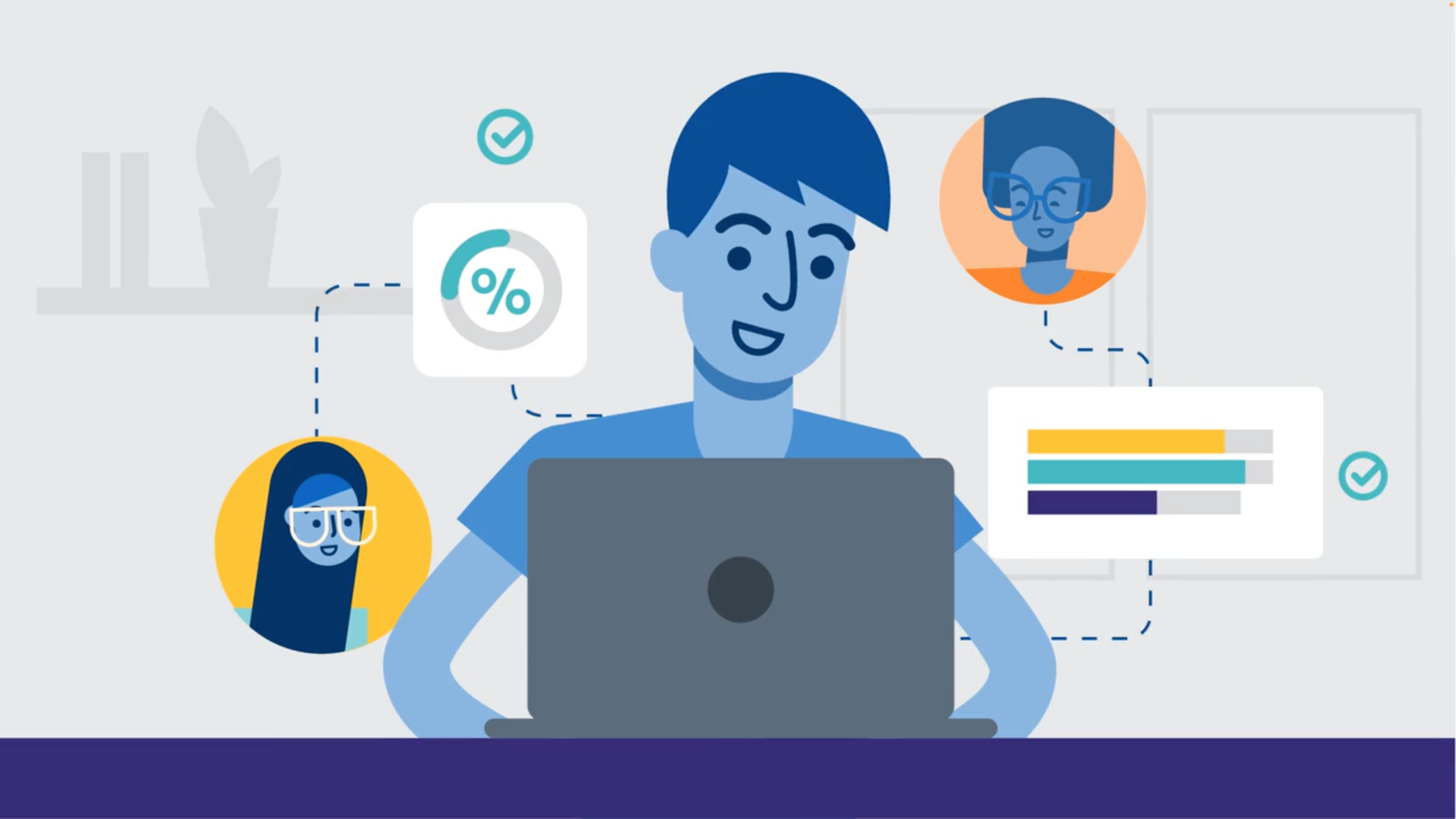
Human-centered design (HCD) helps us understand business problems, user needs, and technical constraints in order to surface the most apparent solutions. It starts with getting into the headspace of the end-user and thinking about why they’re using your product, what they’re using it for, and what tools or information they really need to complete their task.
In the case of web design, this can mean anything from delivering digestible information in the form of a database or documentation, to building a web application that’s intuitive to use the first time you open it. Thinking about web design from a human-centered perspective helps implement truly responsive web design.
On desktop, we know that people will have multiple tasks and screens open. Desktop websites work better for more in-depth searches and complex processes with multiple fields to fill, such as when creating an account. Users will often invest more time into a desktop experience, but they still want to get things done quickly.
That said, human behavior on mobile is much more fleeting. Often the user is only giving the mobile device half their attention. The ability to get small tasks done quickly is a huge benefit to working on a mobile device, as are the easily integrated features like the camera and QR scanning.
Differentiating between mobile and desktop by task and behavior is how to design products that truly meet user needs. Thinking about this ahead of time will keep your product experience intuitive and eliminate costly support requests.
Building responsive web experiences with Skuid.
Skuid is a UX/UI toolkit that enables you to build a better user experience on top of your existing web technology, such as Salesforce or PeopleSoft. Leveling up these powerful platforms with an intuitive layout for both mobile and desktop will help users save time and be more productive.
Learn more about building responsive web experiences by scheduling a demo with Skuid today.


