


Ever wanted to show users where they are in a process? The more complex your workflow, the more helpful (and encouraging!) it can be to have a progress bar or some type of visual indicator showing the user how close they are to the finish line.
Skuid makes it easy to create a progress indicator that compliments your form’s user experience. With our Design System Studio (DSS), you can choose from different shapes, sizes, and variants to fit your design needs — no custom code required.
In this post, we’ll go through five different progress indicator options for your form, each with its own pros, cons, and use cases. And remember, all of these examples are also available in our GitHub repositories, which we’ll link at the end.
Let’s get building!
Option 1: Slider field in a Form
A creative and simple way to re-create a progress bar in Skuid is by using the Form component and a UI-only number field displayed as Slider. Use the Action Framework to update the number field at key points in the process and watch the slider move as you complete each step. To manipulate the look, go into DSS and make a few design tweaks to turn the default Slider into a progress bar.

Option 2: Donut chart displaying percent complete
Need a radial progress bar? Use a donut chart 🍩. This solution uses a UI-only model with two rows to store the progress data that’s displayed on the chart, and you can build it right in the Skuid Composer.

Option 3: Wizard step labels
You might already be using the Wizard component in Skuid to help split up a very long form into multiple steps. However, you might not know that you can also use it to show how much progress the user has made. This option is more like a progress indicator than a progress bar.

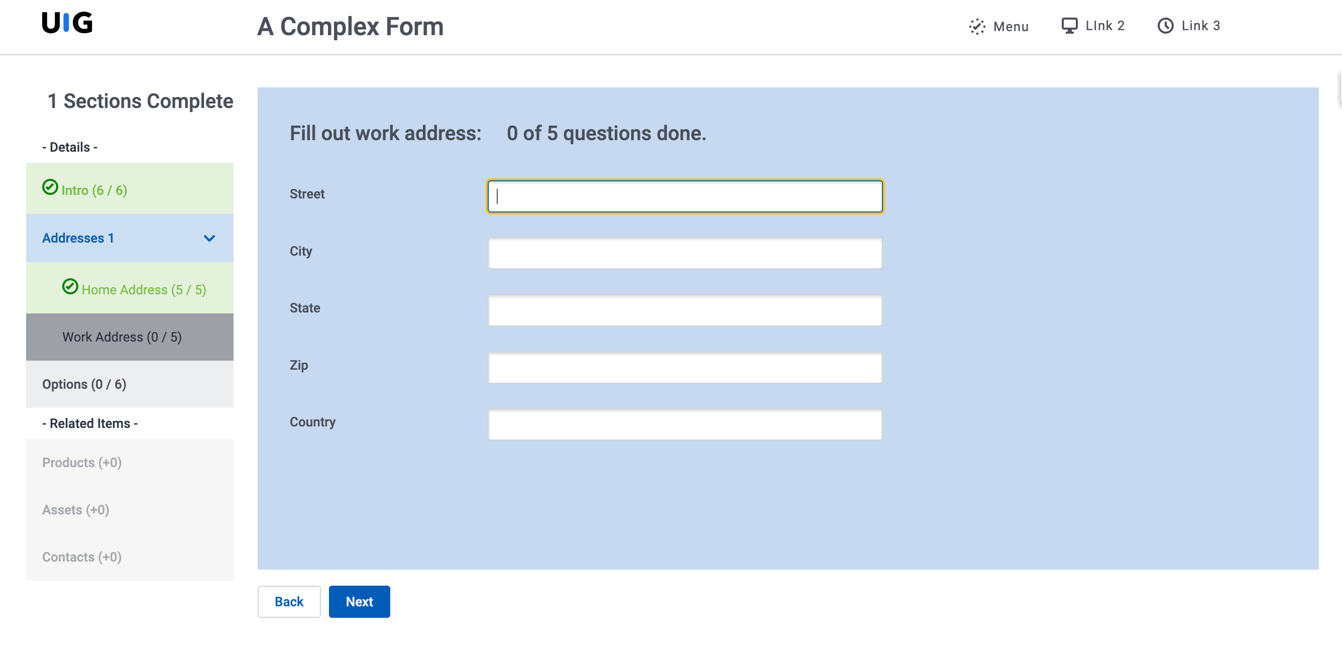
Option 4: Vertical Navigation component with merge syntax
Use merge syntax and Navigation item labels to conditionally show the amount of items in each step that have been completed, then show a checkmark when a step is complete.
Option 5: Custom progress bar with Wrapper and Responsive Grid
Get even more creative with two of the most flexible components in Skuid’s library. Wrappers define step background color, and Responsive Grids set step width. Then, use the accompanying design system to define the step styling through a set of style variants.

You can add a sprinkling of CSS for that arrow effect.
Build your own
Ready to try it out? These links will take you to the folders for the pages and their associated resources:
Don’t forget to import the corresponding design systems as well!
If you want to learn more about the concepts in this blog post, we recommend the following Skuid Skool courses:


